
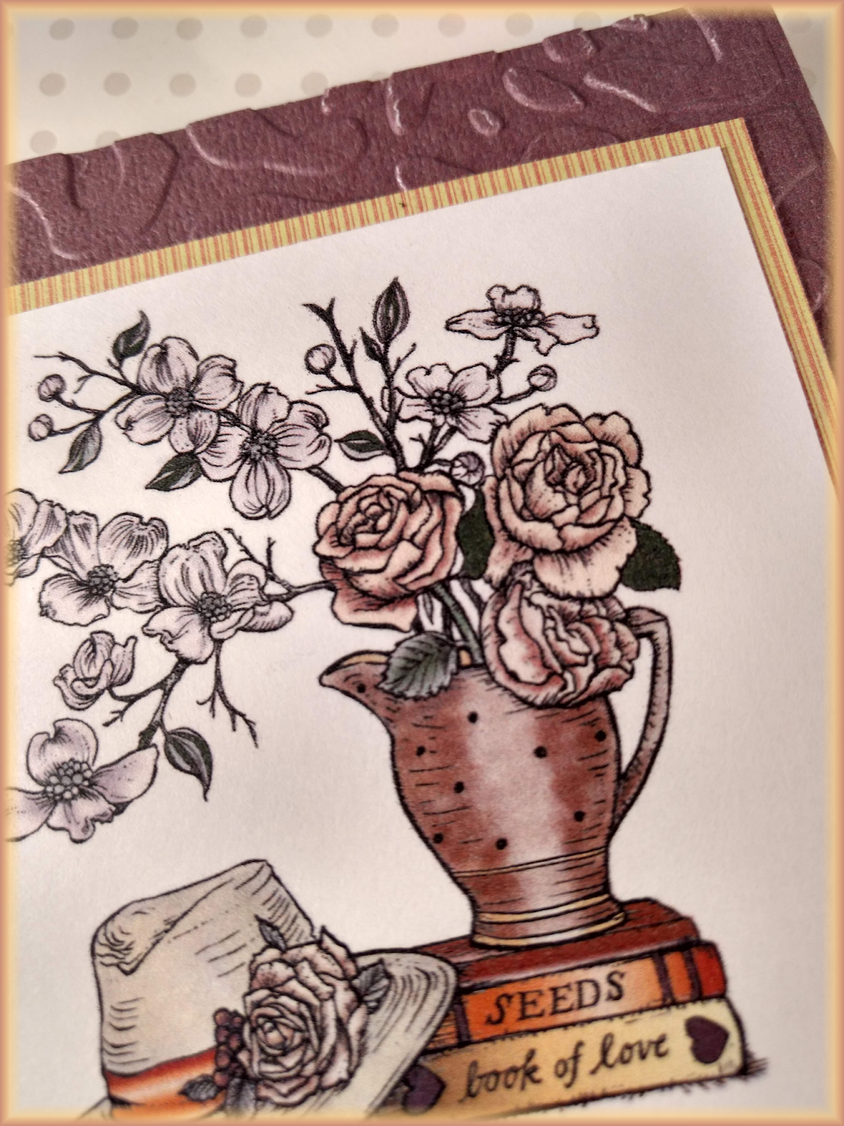
Isn't this a beautiful image! This is a card I designed for two Power Poppy challenges - Hues to Use and Power & Spark Inspire Me. I used Power Poppy's Graceful Still Life digital stamp. For the Inspire Me challenge, I was inspired by Allison's Inspire Me video - Copic Shading and Shadow.

My colors also became somewhat muddied - so definitely room to improve! And I sometimes blended too much, completely blending out my shading.
Overall, I found Allison's instructions exceptionally helpful!! Thanks, Allison! Here is a close-up of my work...I have to say, while my coloring is far from perfect, it doesn't help that when I photograph them, it seems the shading disappears.

Camille, I think you are being way to critical of your work! (we do tend to do that don't we) Your card is gorgeous. And the color work is awesome. Love the embossing too.
ReplyDeleteHugs
Sue
So pretty and earthy! I love these tones together! Very lovely work! Thanks for joining us at Power Poppy!
ReplyDelete